Student Work
Style Guide
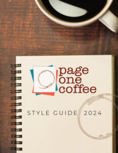
As part of the assignment for the coffee brand, we were tasked with creating a style guide. I included logo versions, brand identification items, and packaging.
Read MoreDahlia
This painting is one wood panel in oils. We began with painting a color that is common in the reference photos, and then we painted in layers, with a lot of subtle color shifts. This painting is about 2/3 finished.
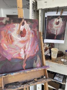
Read MoreLotus
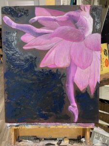
I chose to mix a ballet dance figure with a flower for this work. We used impasto and this photo shows the stage before I added more color and details.
Read MoreThe Rose
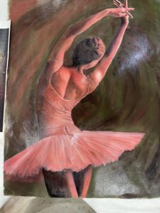
This is entitled, “Rose” as thee will be a rose suggested in the background. This is oil on paper. We started by painting the complementary colors and. then adding glazes over the top. The background is not quite finished, and there are some more details needed on the dancer.
Read MoreProduct Packaging
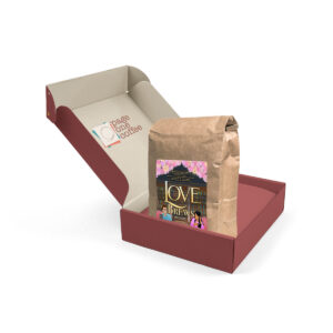
This is the packaging portion of our Brand Identification project. I want to show how a series of coffee flavors might look. Each comes in a box, that looks like a book cover, and the kraft coffee bag has a matching label. The idea is to reuse the boxes in a functional and attractive way.
Read MoreLogo Design
Part of the Brand Identity project was to create a unique logo and stationery items. This shows the logo in color and black and white, as well as the coffee stain element, and a business card.
Read MoreChristmas Card

This greeting card design is the result of using an exclamation point as a graphic. it was created in photoshop and illustrator.
Read MoreInstagram Vote Image
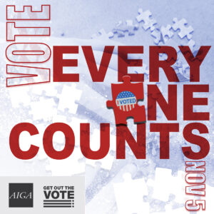
This project was part of the overall Vote Poster project, but the assignment was to adapt the 11×17 poster to a square image formatted for Instagram.
Read MoreEvery Vote Counts Poster
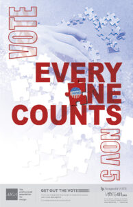
The assignment was to create a poster that promoted the idea of voting without showing preference to either party.
Read More